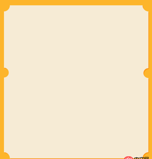
html - 這種圖形如何用css3寫
問題描述
問題解答
回答1:css3里面有個名為倒角的干活
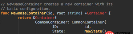
回答2:<!DOCTYPE html><html lang='en'><head> <meta charset='UTF-8'> <title>Document</title></head><body><style type='text/css'> *,body{ margin: 0; padding: 0; background: #fff; border: none; } .bg{width: 500px; height: 500px; background: rgba(253,181,43,1); padding: 12px; } .bg .write_box{ width: 500px; height: 250px; position: relative;background: #fff; overflow: hidden; } .bg .write_box .round{ width: 40px; height: 40px; background: rgba(253,181,43,1); position:absolute; border-radius: 100% } .bg .write_box .lft{ left: -20px; } .bg .write_box .rgh{ right: -20px; } .bg .write_box .botm{ bottom: -20px; } .bg .write_box .tp{ top: -20px; }</style> <p class='bg'> <p class='write_box'> <p class='round lft tp'></p> <p class='round rgh tp'></p> <p class='round lft botm'></p> <p class='round rgh botm'></p> </p> <p class='write_box'> <p class='round lft tp'></p> <p class='round rgh tp'></p> <p class='round lft botm'></p> <p class='round rgh botm'></p> </p> </p></body></html>回答3:
簡單來講,你需要通過 圓形p元素的border-radius 和 包裹的overflow來實現,至于更深的橘色應該是陰影
回答4:真是不好意思,我一直用的firefox,沒想到它對于radial-gradient和chrome還是有不同的。也是我自己理解不夠。
我又修改了下面的鏈接。
===============
使用了CSS3變量來控制半徑大小,暫時想不到更簡單的辦法了在不向下不兼容的路上越走越遠...
DEMO-New
===================================
詳細請看DEMO,純CSS3實現,沒有添加額外標記,雖然我感覺可擴展性不高,不過繼續改善應該還是可以投入生產中的。
CSS3的魔法還有很多,不斷地深入思考,會想到很多有趣的功能。正如《CSS揭秘》作者那樣。
DEMO
相關文章:
1. 前端 - 如何實現自適應的多行文字垂直居中?2. dockerfile - [docker build image失敗- npm install]3. javascript - 如何讓外層div隨內層div的寬度自適應調整寬度4. java - 已知外匯牌價折算匯率5. golang - 用IDE看docker源碼時的小問題6. javascript - 連續點擊觸發mouseleave事件7. css3 - 請教一下,css如何使左右兩邊的div高度自適應相等8. docker-compose中volumes的問題9. centos - rpm更新軟件wkhtmltox報錯10. angular.js - angular內容過長展開收起效果
 網公網安備
網公網安備